Frontier Communications
Digital Templates
Most marketing campaigns don't underperform because the content is wrong, they underperform because the experience around it gets in the way of a click or a form fill. As part of Frontier's campaign refresh, a UX and template system was designed to replace a rushed, one-size-fits-all set of landing pages and emails. The new system was built around funnel stage, mobile behavior, and the specific friction points that had been costing conversions for years.

Challenge
Frontier's existing landing pages and emails were designed in a rush and hadn't been built around how people actually behaved. The form, the entire point of a lead-gen page, was buried below oversized hero images, sometimes requiring a full scroll before a user ever saw a field to fill in. Email templates were long, text-heavy, and rigid. They had no way to flex for different content types (webinars vs. whitepapers, etc.) without a full redesign each time. here was no shared framework, so every asset was a one-off, redesigned every time from scratch, the same usability and layout issues surfacing again and again. The client had lost confidence their current templates could support the year ahead.
When Frontier signed a new contract, it became an opportunity, not just to reskin the old templates, but to rebuild the system around how users actually engage with gated content, funnel stage by funnel stage.
Execution
Turning stakeholder input into UX requirements
The account manager and design team pulled together everything known from the client and from prior campaign performance into a single requirements framework. Mobile accounted for roughly two-thirds of all email opens, so every template needed to be mobile-first from the start. Client feedback also flagged that oversized hero images were pushing the form, the actual conversion point, too far down the page. Content needs varied by stage too, each requiring a different message and form.
That input shaped a template matrix, so every template had a defined purpose, message type, and form requirement before any visual design started.
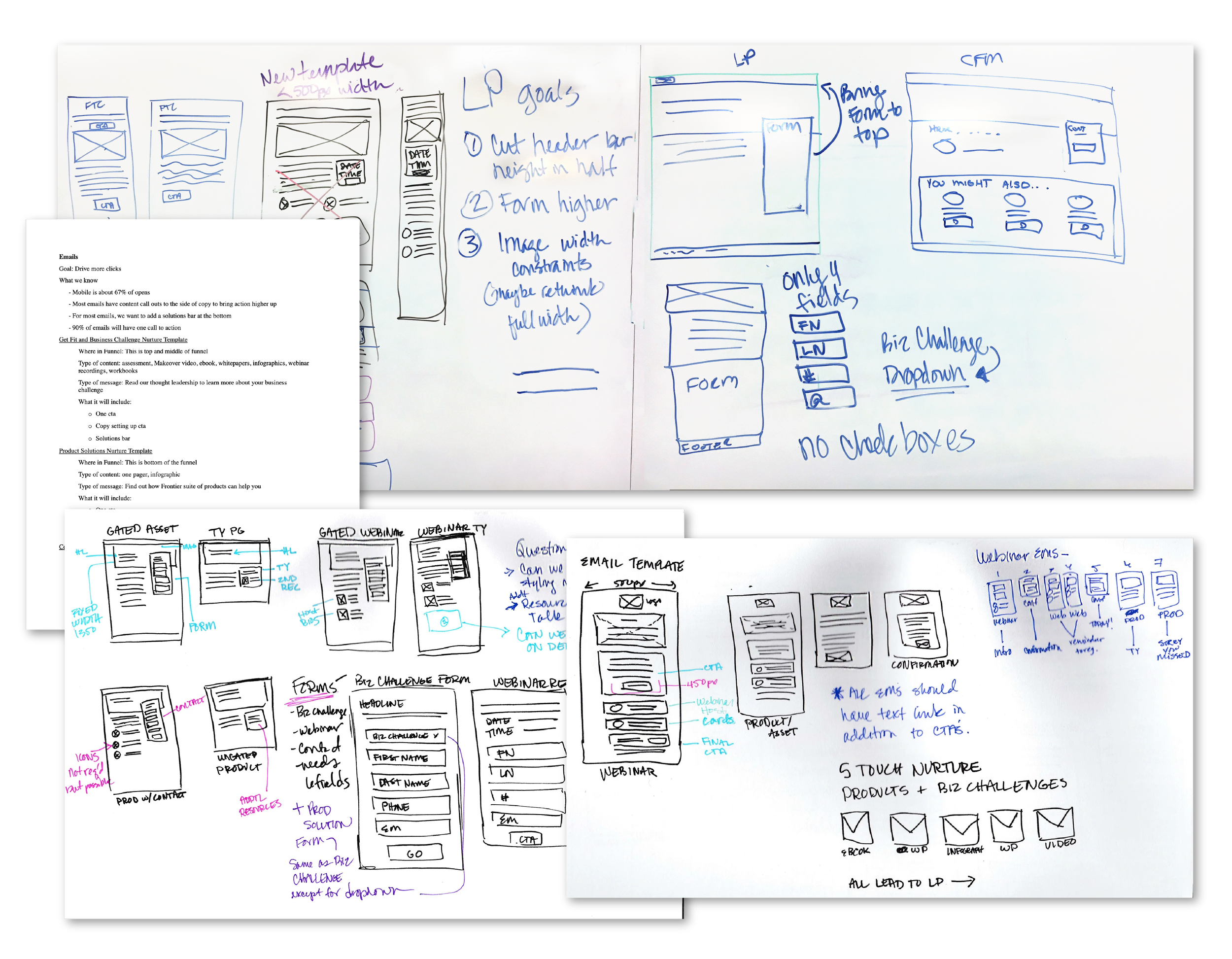
Whiteboarding and wireframing
Working with the creative director, the developer, and the Marketo automation specialist, a series of whiteboard sessions pressure-tested how each template type could share a common structural system without feeling repetitive. From there, every version needed for landing pages and emails was wireframed, so the build team could weigh in on technical feasibility before visual design began.
Key UX decisions
A few decisions came directly out of that research:
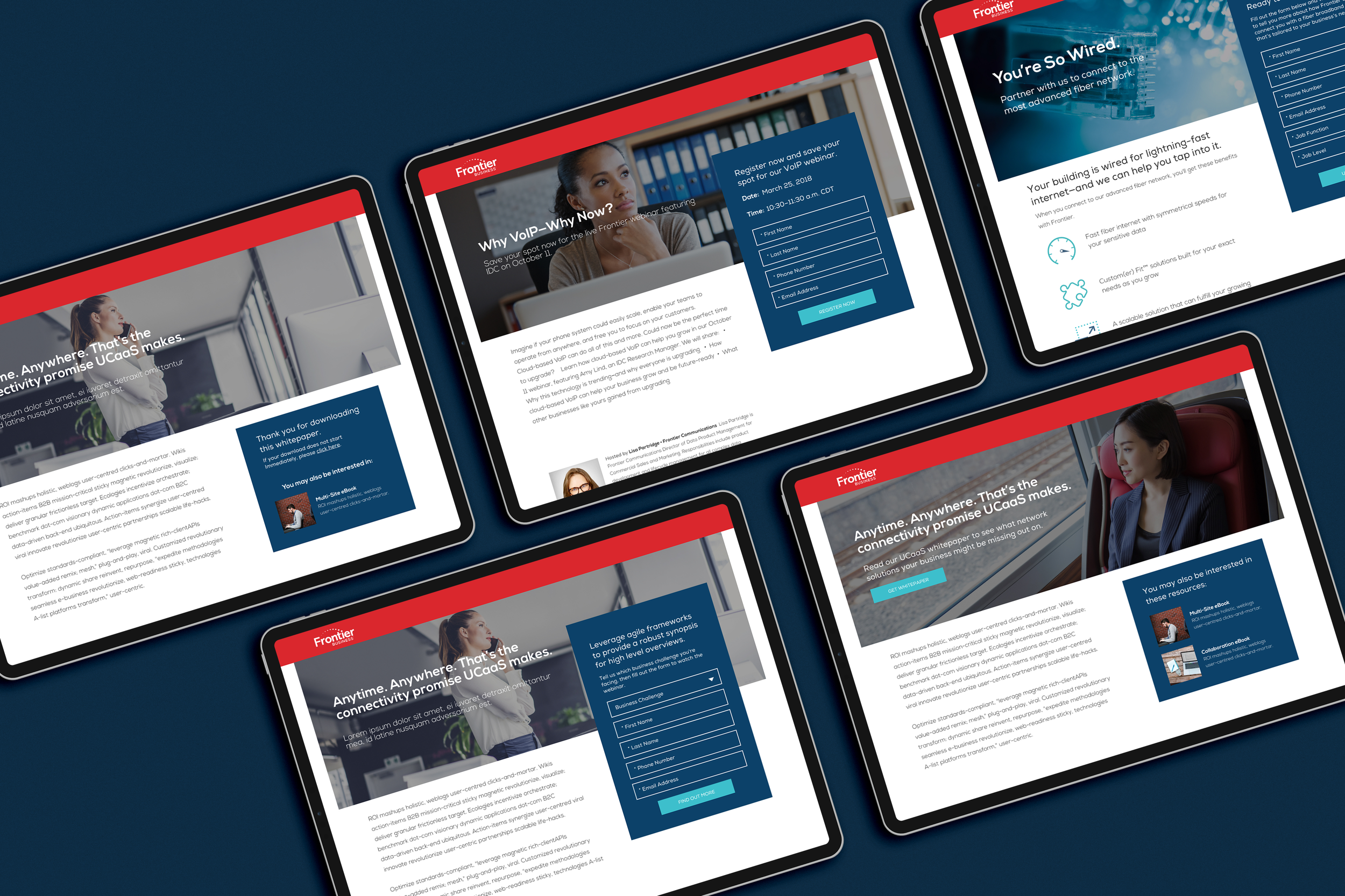
Form placement: The form was pulled up to overlap the hero image, moving it above the fold and putting the page's real goal (form fills) front and center.
Responsive image handling: Hero images were clipped at the sides instead of scaled full-width, keeping faces and key content intact on both large and small screens.
Reduced cognitive load: Body copy was trimmed, asset previews were cut, and paragraphs gave way to bullets, lightening the page and easing the path to the form.
Inline confirmation state: Confirmation and related content now load directly in the form module instead of a separate "thank you" page, cutting a full page load and keeping momentum.
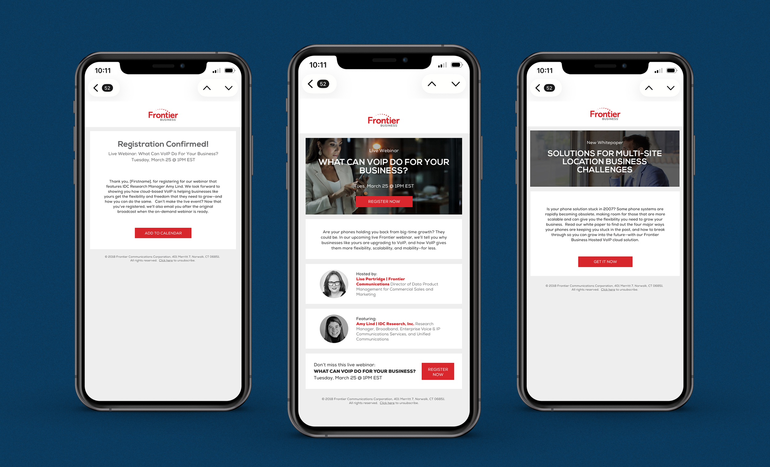
Mobile-first, modular emails: With mobile at ~67% of opens, emails were rebuilt at a mobile-friendly 500px width with modular sections and flexible CTA placement by funnel stage.


Delivery
The templates went through a couple of rounds of internal revision before going to the client for review. They were approved with only minor edits, a strong signal that the requirements-gathering work upfront had done its job of surfacing the right problems before design even started.
Results and Impact
The result was a scalable, funnel-aware system rather than a set of one-off assets: every future Frontier landing page or email could be assembled from a shared, tested UX framework instead of being redesigned from scratch. It gave the client a clear, flexible system for the year of campaigns ahead, and it resolved the specific friction points (buried forms, oversized imagery, rigid long-form email layouts) that had been driving dissatisfaction with the previous templates. Both the client and the internal Bulldog team came away with a system that actually matched how their users engaged with content.
Contributions
Research & synthesis: Translated client feedback and account-management insight (behavioral data, funnel requirements, content types) into a structured UX framework before any visual design began.
UX design: Defined key interaction and layout decisions, including form placement, responsive image handling, copy hierarchy, and inline confirmation states, based on identified user friction points.
Systems thinking: Designed a modular, funnel-mapped template matrix so every asset type had a defined structure, rather than solving each new campaign from scratch.
Visual design: Designed the final landing page and email layouts, including hero image treatment, form styling, typography, and modular content sections, translating the wireframes and UX decisions into a polished, on-brand visual system.
Collaboration: Partnered with the creative director, Marketo developer and automation specialist through whiteboarding and wireframing to validate feasibility before visual design.