Oracle NetSuite
SuiteAnswers
When something breaks in their NetSuite instance, SuiteAnswers is where most customers turn first, but ten years of accumulated pain points meant search worked poorly, articles were hard to trust, and getting to a resolution took too long. As the visual design lead on the SuiteAnswers 2.0 team, I redesigned the experience end to end: a search-first homepage, a scannable article layout, a proper home for video, and a clear path to escalation, all grounded in four rounds of user research and validated with real customers before launch.

Challenge
SuiteAnswers is the most frequently used source of user assistance across the entire NetSuite product, but the experience hadn't been redesigned in ten years, and it showed. Search didn't understand the terms customers actually used, filters were unreliable, articles had no formatting, screenshots, or code samples, and the case-submission flow lost work and buried the details Support needed most. Customers had a name for the whole ecosystem of help surfaces they had to piece together: "the corn maze."
Before any screens were drawn, our team ran a survey of 346 customers, 21 contextual interviews, two rounds of tree testing, and design-feedback sessions with 7 customers. I used those findings, from persona data to verbatim frustrations, to guide both the UX decisions and visual design, from how the experience was structured to where visual weight and polish needed to go. The timing added another layer: Oracle had just introduced its new Redwood design system, but Redwood hadn't rolled out across NetSuite yet, so SuiteAnswers 2.0 needed to feel distinctly more modern today without contradicting where the rest of the product was headed.
Objectives
Build a visual bridge, not a leap
Redwood's textures and color palette combined with NetSuite's existing UI colors, so the new SuiteAnswers felt current without orphaning itself from the product it lived inside.
Put search front and center
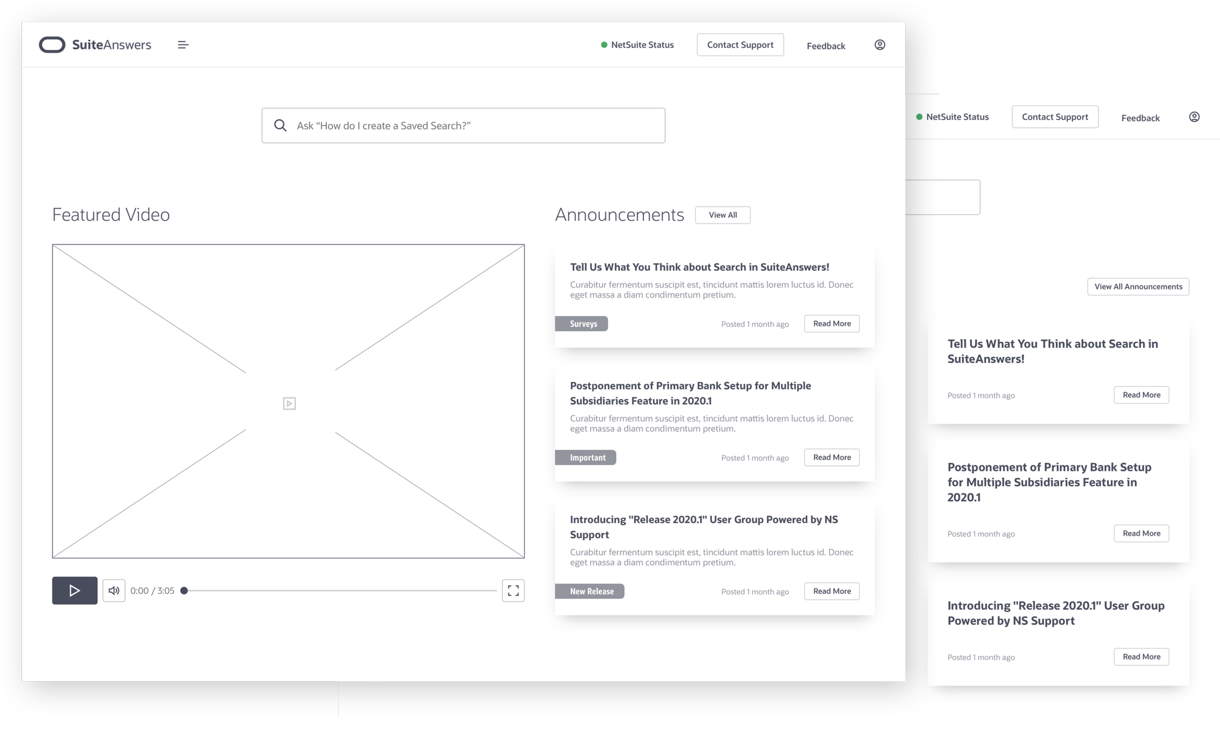
86% of visitors to SuiteAnswers came to search, not browse, so search became the literal focal point of the homepage, not a secondary element competing with announcements and navigation. It’s framed by a textured background to give the Search bar its own visual identity throughout the site.
Make the search page feel purposeful
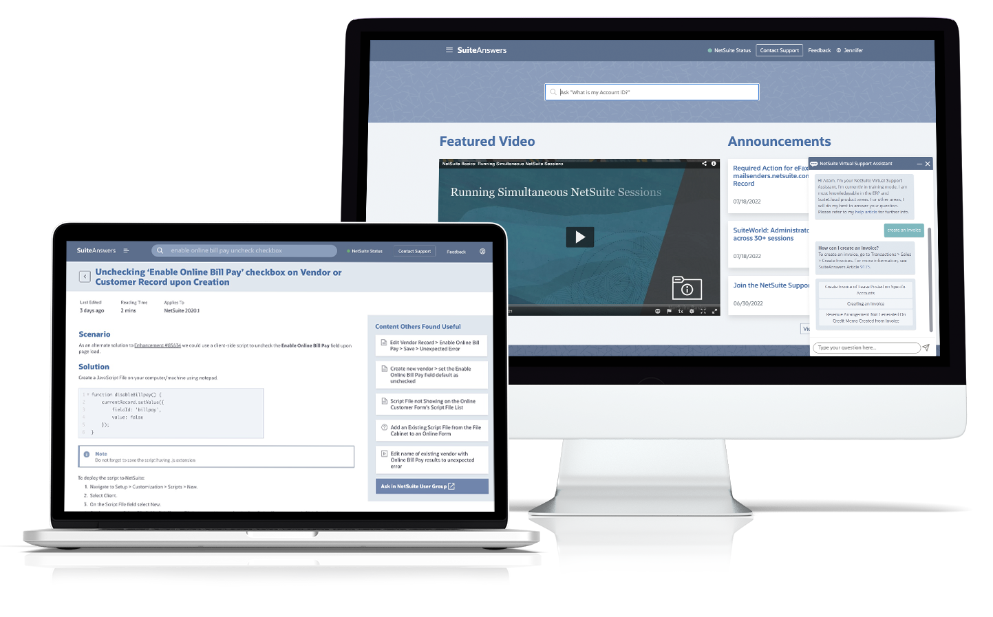
Filtering by Content Type and Target Audience together, rather than as two disconnected steps, matched how customers actually thought about their own questions, by role and by the kind of content they needed. It was one of the most well-received parts of the redesign in testing.
Give video a real home
Customers told us repeatedly that they wanted more video content, especially for complex features. An in-page player with related-content previews and voting and view feedback replaced what had been a bolted-on link.
Make articles scannable and trustworthy
Bold section headers, callout banners for special notes, and a clearly surfaced "content others found useful" module addressed some of the most consistent research complaints: outdated content, no formatting, and no signal for what to trust.
Simplify the path to a resolved case
On the contact and escalation screens, the account number and country selector got more visual prominence, and the release preview number moved out of the way: small hierarchy fixes that removed friction right when customers were most frustrated.
Approach
Every visual decision traced back to a research finding. When we saw that 4 out of 7 test users never scrolled past the homepage fold, I reduced the initial, oversized Announcements module and gave that prime real estate to video instead. When the tree test showed customers weren't relying on the category tree to navigate, only to refine an existing search, that told me the categories panel could be visually secondary to Search without hurting usability.
I worked closely with our UX designer and researcher throughout, using the same personas, journey map, and interview notes they used, so that the visual system reinforced the interaction decisions instead of working against them.
Execution
Rather than finalize a single direction in a vacuum, we took wireframes and near-final visual designs into feedback sessions with 7 real customers, administrators, developers, and end users, before development locked anything in. Customers who once had no real way to share an article responded strongly to the new share option, and the idea of a search bar that would auto-populate suggestions as they typed was well liked by everyone. The "Content Others Found Useful" module on article pages was called out specifically as a genuine improvement, not just a nice placement. Most customers described the redesign overall as cleaner, more spacious, and less busy than the SuiteAnswers they were used to, a reaction to the experience as a whole, rather than to any one element.
Results and Impact
SuiteAnswers 2.0's visual design had to feel like a real step forward for customers who'd been asking for one for years, while acting as a credible bridge to Oracle's future design direction, a goal validated directly by customer feedback:
71% of customers said the homepage felt cleaner and less cluttered than the old version.
86% said they would use the new Content Type and Target Audience filters.
86% of customers described the redesign overall as cleaner, more spacious, and less busy than the SuiteAnswers they were used to.
Grounding every screen-level decision in research made the final design more than a fresh coat of paint. It was a visual system built to hold up under the same scrutiny as the UX decisions underneath it.
Contributions
Owned the visual system: palette, texture, and typography decisions that bridged NetSuite's legacy UI and Oracle's Redwood direction
Designed every core screen: homepage, search, video, article, announcements, and contact/escalation
Translated research into hierarchy: used survey data, tree-test results, and interview findings to decide where to put visual weight
Iterated against real user feedback: sat in on customer feedback sessions and revised layouts based on what customers actually said, not just internal opinion
Presented final direction to executive stakeholders, including Product Management, UX, and Research leads, ahead of release