
SuiteAnswers User Help Center
Redesigning NetSuite’s most frequently used source for user assistance was long overdue. It had been ten years since the design was updated and users where frustrated. The old version lacked important functionalities and was a decidedly un-delightful user experience. Prior to design work, four sets of research were conducted to uncover pain points and areas of improvement.
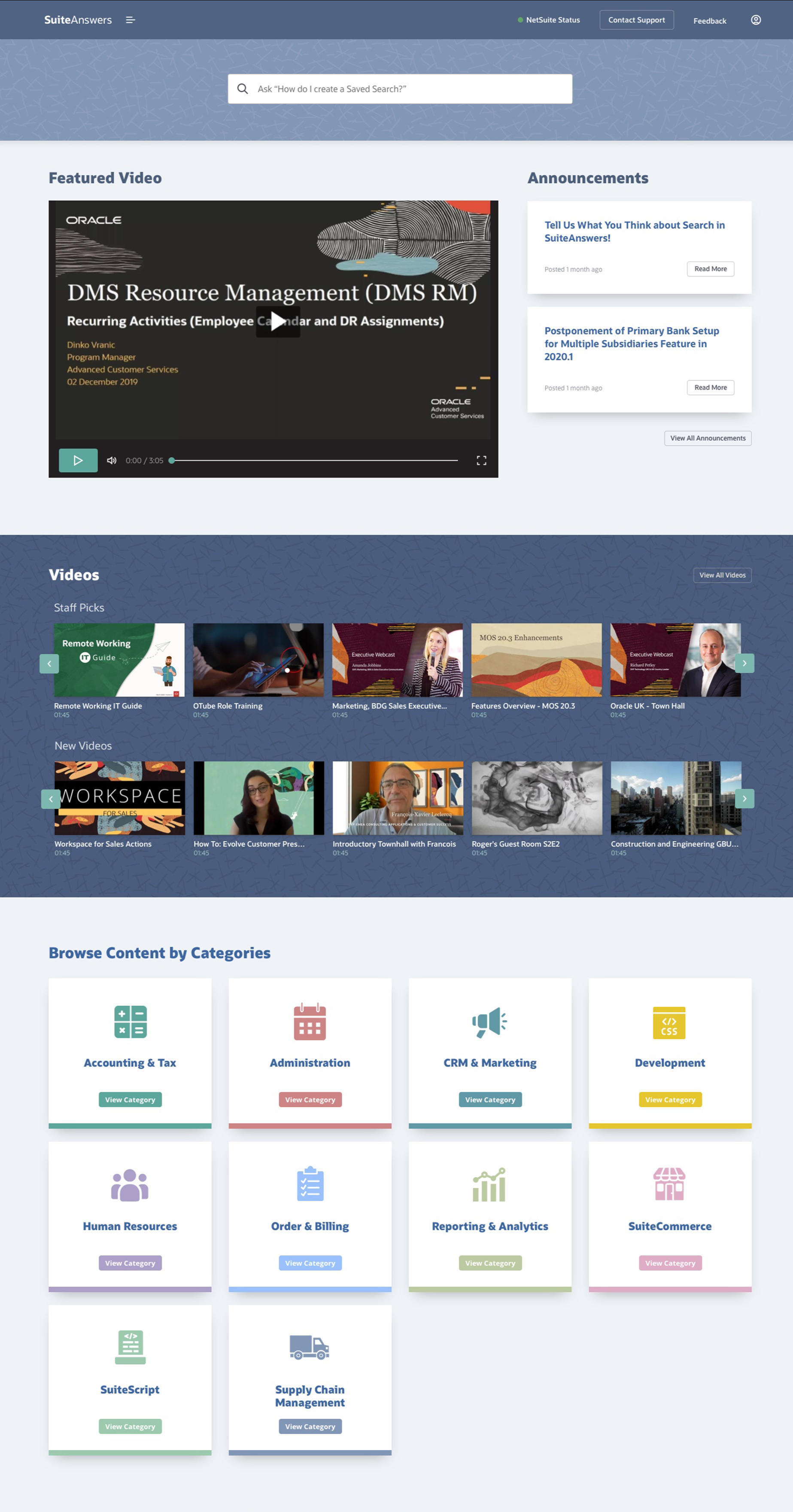
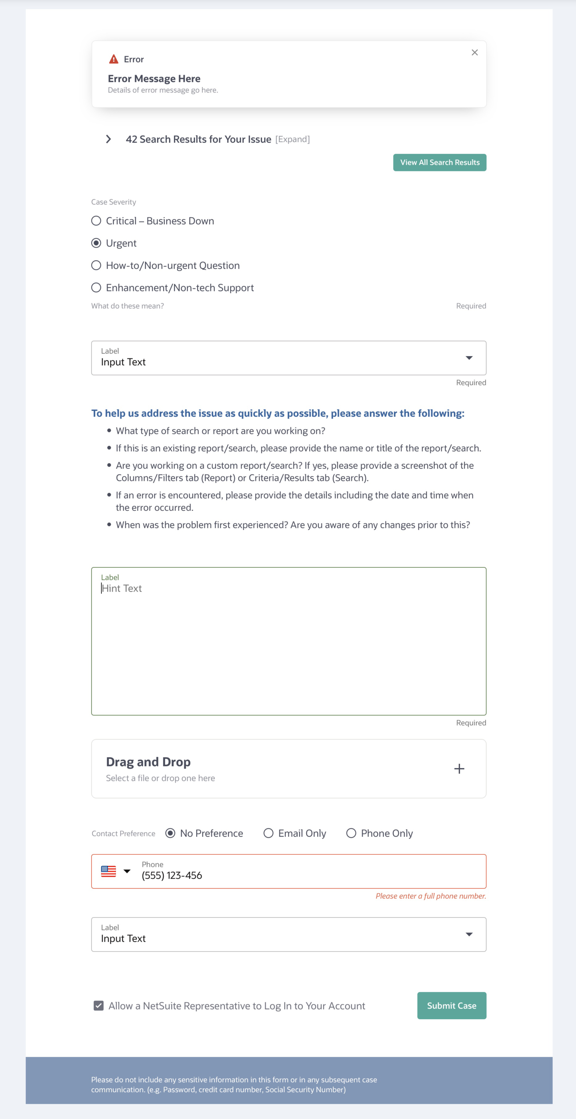
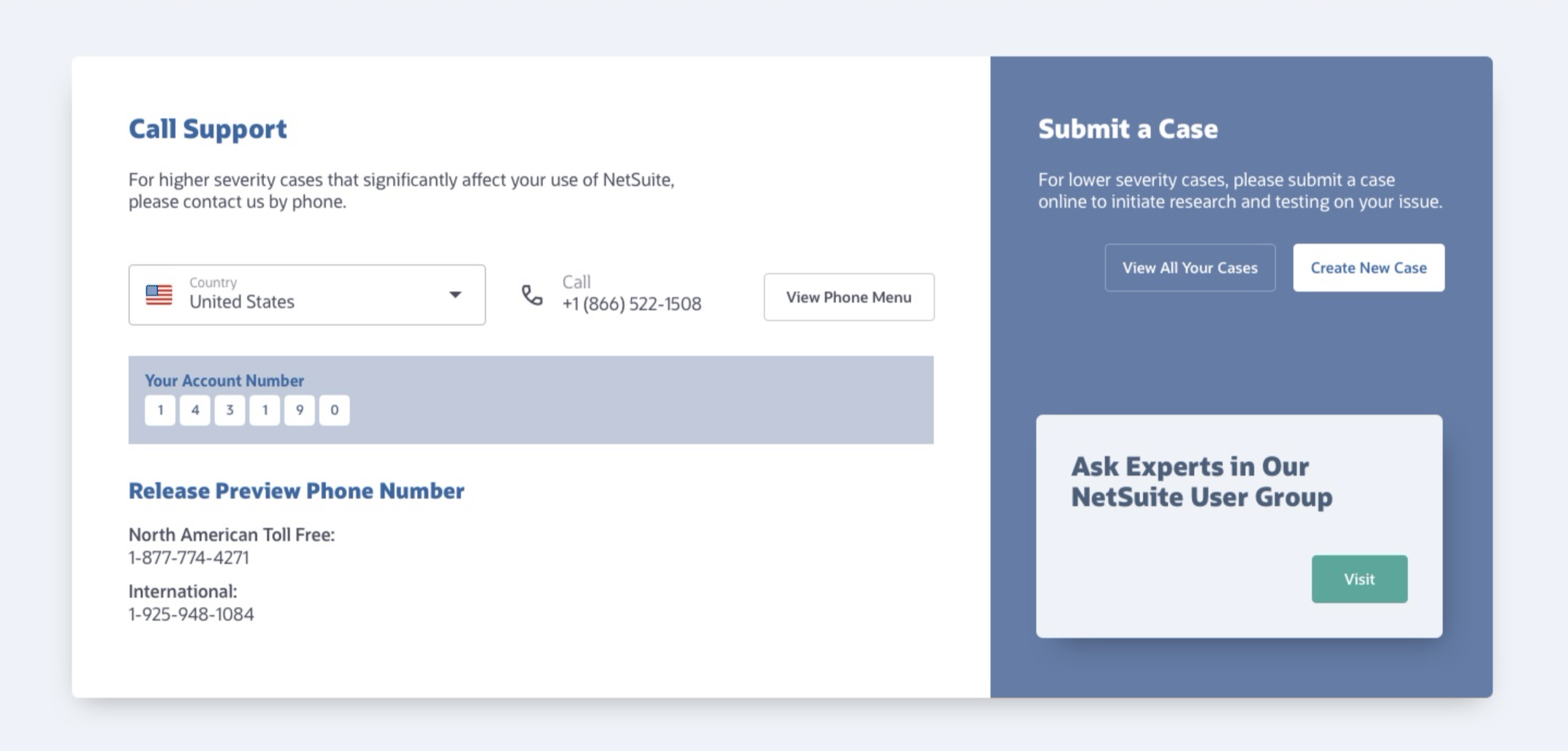
The main insights from those researchs sessions showed that the main functionality of SuiteAnswers should revolve around Search, so that component was moved to front and center. Users also wanted improvements in the articles like step-by-step guides, screenshots and code examples and videos imbedded in the articles. The new site also needed an area for escalation including case submission and contacts support lines that are easy to access.
This redesign was happening at an interesting time in the world of NetSuite visual design. We had a design style guide that had been in use for many years but were in the middle of implementing an updated look and feel that aligned with Oracle’s recent redesign called Redwood design system.
Per discussions with high level stakeholders and design leaders, we decided to use some of the updated textures and colors while not completely abandoning the current style. We, in essence, created a bridge between the styles, something that could look more modern and last until Redwood was fully deployed in NetSuite (at which point it would be reskined).


Following the design phases, research initiated design feedback sessions with users. Here are some of the main insights:
Most users had a positive reaction to the overall look and feel
5 out of 7 users said the homepage felt cleaner and less cluttered than the old version
6 out of 7 users said they will use the filters, including Content Types and Target Audience